
Websites today are more than digital brochures. They act as interactive communication platforms, customer service hubs, online storefronts, and brand identity anchors. Applying Web Design Principles for Modern Sites helps ensure that digital experiences are not only visually appealing, but also intuitive, accessible, and able to support business outcomes. Modern users judge credibility within seconds, and design quality has a direct impact on trust and engagement. The effectiveness of a website depends on how well it balances aesthetics with usability, speed, and strategic communication.
The Foundation of Clear Visual Hierarchy
Visual hierarchy determines how users interpret the flow of information on a page. When structure is unclear, visitors struggle to find what they need and are more likely to leave. A strong hierarchy guides the eye through key elements in a natural and logical order.
Elements that influence hierarchy include:
- Font size and typography style
- Placement and spacing
- Color contrast and emphasis
- Imagery used to draw attention
Large headlines, contrasting sections, and properly spaced content help ensure that the most important message stands out. Effective hierarchy encourages exploration rather than confusion.
Typography That Enhances Legibility
Typography is more than style. Good typography ensures that users can absorb information quickly without experiencing visual strain. Modern sites often choose simple, clean typefaces along with measured spacing.
Factors to Consider in Typography
- Use font weights to distinguish headers from body text
- Set line-height for comfortable reading on both desktop and mobile
- Select no more than two or three type families to maintain consistency
- Prioritize readability over complex decorative fonts
Readable typography keeps users engaged longer, improves comprehension, and supports a professional visual voice.
Consistency Across Pages and Components
Consistency helps users understand interactions without re-learning patterns. When design elements behave predictably, users develop trust in the site.
Areas where consistency is essential:
- Navigation menus
- Button styles and call-to-action placements
- Color palette and iconography
- Form layouts and input field interactions
Consistency does not mean monotony. It means structured familiarity that reduces cognitive load and improves usability.
Strategic Use of White Space
White space, also known as negative space, is the empty area around text, images, and elements. It is not wasted space. White space creates breathing room, separates content sections, and guides visual flow.
Why White Space Matters
- Enhances readability
- Prevents clutter and distraction
- Highlights key content
- Creates a refined and modern appearance
Modern sites tend to favor open layouts rather than dense, text-heavy presentations. Effective white space creates a sense of sophistication and clarity.
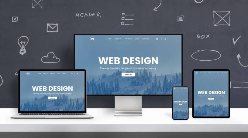
Responsive and Mobile-First Layouts
Mobile browsing now exceeds desktop usage in many industries. A site must work seamlessly across screens, from smartphones to large monitors. The mobile-first approach ensures that essential content and functionality are prioritized from the start.
Techniques for Responsive Design
- Fluid grids that adjust based on screen width
- Scalable images that maintain sharpness
- Dynamic navigation that simplifies on smaller devices
- Touch-friendly interactive elements
Sites that ignore mobile optimization risk poor user experiences, lower engagement, and reduced search ranking visibility.
Intuitive Navigation and User Flow
Navigation should feel natural. Users should not have to think about where to click next. Menus, links, and page structures should help guide them without extra effort.
Principles of Effective Navigation
- Keep navigation labels clear and descriptive
- Limit the number of top-level menu items
- Provide internal linking to related content
- Highlight active sections so users know where they are
A well-designed navigation structure reduces frustration and encourages exploration.
Performance Optimization and Speed
Even the most visually appealing website will lose users if it loads slowly. Site speed affects SEO, conversion, and retention. Modern sites need to manage asset sizes and request loads strategically.
Performance Techniques
- Compress and optimize images
- Minimize use of heavy scripts
- Use caching to reduce repeated loading
- Implement lazy loading for multimedia content
Mobile users are especially sensitive to performance, making speed a core design priority.
Accessibility as a Core Design Requirement
Web accessibility ensures that everyone, including users with disabilities, can use and interact with the website effectively. Accessibility also demonstrates inclusivity and professionalism.
Accessibility Best Practices
- Provide text alternatives for visual media
- Use readable color contrast ratios
- Ensure keyboard-only navigation is functional
- Add clear labels to form elements
Accessible design expands your audience and aligns with ethical, inclusive digital practices.
Meaningful Use of Imagery and Video
Images and video can add emotional depth and clarity when used intentionally. However, random visuals lead to distraction rather than value.
Guidelines for Visual Media
- Use authentic images that reflect real brand identity
- Ensure images are high-quality but optimized
- Use video to demonstrate processes or stories
- Avoid visual clutter or meaningless stock content
Strong visuals should support storytelling, not overshadow it.
Calls to Action That Drive Engagement
Every website should direct users to take meaningful actions, whether learning more, subscribing, making a purchase, or contacting support. Calls to action should be clear, noticeable, and persuasive.
Effective CTA Strategies
- Use action-oriented language
- Position CTAs in visible and natural locations
- Reinforce CTAs with value statements
- Use contrast to make CTA buttons stand out
Well-placed CTAs create smooth pathways toward conversion.
Personalization and User-Centered Design
Modern sites are most successful when tailored to user needs. Understanding why users visit the site helps shape layout, messaging, and features.
Methods for User-Centered Design
- Conduct user behavior analysis and feedback collection
- Identify user pain points and address them directly
- Provide adaptive content or dynamic recommendations
- Develop journey maps that account for entry points and next steps
Design is not just visual; it is a reflection of user priorities.
Footer Design That Completes the Experience
Footers often serve as final guidance points. They can organize essential links, legal information, or contact channels without overwhelming the main interface.
Purposeful Footer Content
- Contact information and business details
- Privacy and policy documentation
- Secondary navigation for less critical links
- Social media or newsletter subscription prompts
A structured footer reinforces credibility and provides closure to the browsing experience.
FAQs
How often should a modern website’s design be updated?
Most websites benefit from design evaluations every 18 to 36 months. Technology, user expectations, and branding evolve. Regular updates ensure that usability, performance, and visual relevance remain up to date.
What is the impact of color psychology in web design?
Color influences emotion and behavior. Different shades evoke different reactions, affecting brand perception and user decision-making. Choosing colors should be strategic and aligned with brand identity and message intent.
Should animation be used in modern web design?
Animation can guide attention, enhance interactions, and explain complex concepts. However, it should be light, purposeful, and not distracting. Overuse can slow performance and overwhelm users.
Can a site be both visually complex and easy to use?
Yes, but it requires thoughtful hierarchy, clear organization, and restrained visuals. A visually rich site must still prioritize user comprehension and simplicity in navigation.
What role does content play in design effectiveness?
Content and design work together. Effective design supports readability, emphasizes key messages, and encourages interaction. Without strong content, even beautiful design lacks functional purpose.
